_______________________________________________________________
Excellent work, Russell, in terms of the precise and well argued consideration of the technical and symbolic codes. In those areas, I would consider this a B with potential for a higher grade if all criteria were met (see HTI below). You have attempted to link some theories and used terminology appropriately, showing Good work in this area (C) . It was good to reference a different poster for the same film and compare.
HTI - again, reference to other texts has been missed - this is essential - so you must find other, older posters within the genre. I would suggest La Femme Nikita, because the other thing you must do is write about the gender representation issue, in the sense that The Bride is both stereotypical and unique. Can you, for instance, link the choice of weapon to the idea of femininity versus masculinity?
_______________________________________________________________
 |
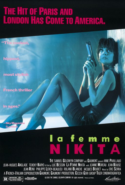
Poster of Kill Bill Volume 1,
used on cinema release
|
Stereotypically, conforming to the thriller genre this poster of 'Kill Bill' presents the hero character in the centre and to the front of the image, making her more noticeable on a plain background. This establishes a relationship between the viewer and character in the poster early on before they have even watched the movie. The character is using direct address in the picture singling out the viewer, making it seem unique towards them, it looks as though she is judging you. On an initial glance the first thing you notice is definitely the bright yellow colour scheme, this colour symbolises energy, action excitement and most relevant caution. This use of colour represents the character known as 'the bride' suggesting that the antagonists should be cautious and watch out for her. You can also see a black strip along the background of the poster which symbolises power, elegance, death, mystery, strength and authority all these can also be applied to the character of 'the bride' as from the whole movie we learn very little about her only her reason for revenge. With the mixture of yellow and black it gives the image of a bee and it's stripes giving off a warning.
The tagline "A ROARING RAMPAGE OF REVENGE" adds to the excitement and intensity of the title of the film 'Kill Bill' it lets the audience get a better grasp as to what the film is about maybe even suggesting who 'Bill' is. The colour of the tagline is in red (capital) letters symbolising blood. This connotates pain, revenge, hatred, danger and alternatively romance which in the film we find out about the brides' relationship with Bill. To apply Todorov's narrative theory the title of the movie suggests that it is already in a state of disequilibrium in which the protagonist (the bride) needs to sort out for herself. Mixed with the name of the character and the idea of a 'rampage' gives off an unusual thought that a bride would be in such a situation, this suggests that with the film all is not what it seems.
The jumpsuit (also yellow and black) is designed like leathers for a motorbike – giving the character a rebellious and fearless look of nature to her. This combined with her facial expression gives her the image of power.
Another thing which is really noticeable is the character in the poster is holding a samurai sword (Katana), this relates directly to a, the storyline and b, to its director Quentin Tarantino who is renound for his love of Asian culture. The sword connotates power and authority. This could be considered a bit unusual to have such an item in a thriller movie, as the majority have high-tech guns. Some might also suggest that it is unusual for female characters to have weapons in this type of movie as stereotypically they aren't the hero. Most people would assume the style of weaponry to be very masculine (such as samurai fighting) although for those who see the film they will realise this is the main weapon used throughout.
 |
Teaser poster of Kill Bill Volume 1,
used initially to promote the film
before release.
|
All factors which are featured in this film – it gives a lot away about what might relate to this film. In red is also ‘Volume 1’ which draws attention to this text and implies that this is the first of a series or the first instalment to this particular story, engaging the audience to maybe think about other sequels.
In this other poster (to the right) it has the same colour scheme as the final poster but this could be considered as one of the teaser posters before launch. The tagline on this one however related to the unusual style of the thriller with the words "HERE COMES THE BRIDE." this is similar to a play on words in which instead of it being used in the 'traditional' sense it is interlinked with the idea of revenge that the antagonist 'Bill' is suppose to fear her. You can see this in silhouette of the ninja quite clearly not the 'typical' bride.
Overall this poster is simple but effective, it is clean and streamlined, the simple bold colour scheme makes it easy to navigate as well as setting a picture in peoples minds (i.e. they will remember it in the future).
 |
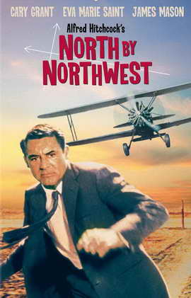
Poster from thriller
La Femme Nikita (1990)
|
Comparing Kill Bill to that of the movie 'La Femme Nikita' they portray women contrastingly. In Kill Bill they show the female character as a strong heroic type person with the weapon confidently being held by her, it looks like she means business and she knows what to do with the Katana. The Bride is in the stance as though the person viewing the poster should be begging for mercy in the photograph in the first poster she is clearly in control of the situation. Even in the second Kill Bill poster although this is not a real picture of her the silhouette is in a fight position prepared for combat.
Whereas if we compare these posters to the that of La Femme Nikita women are portrayed completely different. In the main image of this feature we see what is presumed the main character in a curled up position. They way that the gun seems huge compared to her suggests that she may not be fully aware on how to use it. It is also noticeable that she is not in the right clothes for a hero in a thriller, she is dressed in formal wear (a black dress and heels). It could be argued that the black dress is symbolising her elegance but it could also be argued that it is foreshadowing her future career as an assassin (i.e. death and mystery).
The shot that they have used in Kill Bill Volume 1 is a long shot used to show the full figure (outfit) of the Bride. It also allows the viewers to see all of the hero as to make early interpretations of the character. Conversely the shot used in La Femme Nikita is at the same height as the hero, it is still technically a long shot as you can see all of the figure however it is similar to a point of view (POV) shot making it as though we are there in the situation with the character, makes it seem as though we are hiding down there with her. She is looking at something, presumably dangerous behind is, this again can spark debate as to what it is she is staring at.
From the stance that she is in (bent hiding on the floor behind a wall) suggests that she is in a weak position looking up frightened as to who may be after her. For a female charter it is typical for Nikita to appear more vulnerable waiting for help (stereotypically from a masculine character). However this is unconventional for a 'hero' character as they are typically represented strong and prepared, such as the Bride in Kill Bill which for a female lead role is unconventional and unique both in the terms of style and story.


