
"Top work, Russell, a really thorough analysis that approaches the work from the viewpoint of key media concepts and names theories in places. In the inevitable second draft (everyone will do one), I'd need to see closer reference to the text as evidence, for example, how is the character representing authority? Are we sure he is representing authority, or would a more deviant (uses and gratifications) reading suggest otherwise? What evidence is there that the woman might be a donor (or maybe even a dispatcher)?"
_______________________________________________________________

The main image shows the protagonist. The image is central and in front of most items situated in the poster, this makes him stand out from the plain grey background.
The character on the poster conforming to thriller movies is the hero, possibly in this case a bit of a vigilante. The clothes the hero is wearing gives the idea of concealment and mystery through the dark plain clothes which actually goes against the typical image of a hero character in most films, combined with his profile of half of him in the shadows, this possibly suggests that there is more to him than meets the eye and again going with the idea of possibly a vigilante style character.
A main theme is this (and other thriller posters) is the use of weaponry in the photograph it portrays a masculine styled movie with the female characters situated in the background of the poster, by displaying this prop it immediately shows the genre of the film and allows the audience to build up expectations before watching the film. Perhaps if we relate to Propps’ character types she could be the princess, stereotypically the prize at the end of the movie if not maybe some sort of donor to help the hero along his quest as this is stereotypical for thriller movies i.e. this is how the mass population will interpret it, authority is represented positively, this borders onto the Marxism idea of audience models. Through the hero having his pistol half drawn this suggests and element of action and quite possibly a disequilibrium in the story which he hopes to rectify with the use of that gun. We could also argue that the hero actually looks quite deviant in this first picture with a look of gratification showing that he has some personal emotional happiness that he has/ or will fulfil his goal.
If we look to the back of the poster we see a woman (to the right of the hero) with a telephone to her ear, she does not seem distressed i.e. like a princess-type character but possibly a donor character to help the hero along with his quest by giving him/ aiding him with her personal skills or even a special item which will give him an advantage against the villain. Alternatively she could be the dispatcher who is the person setting the hero off on his mission however given that the movie is about a man looking for his daughter then it is more likely the hero himself is also the (self) dispatcher.

On the poster the creators use ‘expert witnesses’ as a way of promoting the poster calling it “the best action flick since Bourne” suggesting that the movie isn't necessarily your stereotypical action thriller, this in turn will engage the audience making it more attractive for them to go and see it.
The messages on the poster are a mixture of visual and written. Through the costume of the protagonist it communicates with the viewers of the poster the style of the movie. A message is also given across through the use of the bold words on the tagline such as “TAKEN” “HUNT” “FIND” “KILL” these words suggest deceit and murder all themes of a thriller that would appeal to their key audience as these films show situations which ordinary people wouldn't get to experience such as guns, fast cars etc. The specific words are in a different colour (white) so that they stand out, this also gives the audience a sense of how they link together including how they link to the story.
If we look at the second poser from Taken, this one is more likely going to be used for promotions after release as it quotes far more bout the film as the one above does. In this poster the character is again (stereotypically) up front and the only person featured in the image. What we see first on here is that the character is hidden behind the 'tagline' on the feature. The tagline reads "I DON'T KNOW WHO YOU ARE... BUT IF YOU DON'T LET MY DAUGHTER GO... I WILL FIND YOU... AND I WILL KILL YOU" which adds to the atmosphere of the overall poster, combined with the minimal lighting gives a sense of grieving for his daughter, it makes you empathise with the character and hope that the can get her back. For those who have seen the movie it will be a well known phrase which is instantly associated with the first Taken movie. The colour orange is used for the title which instinctively draws attention to the name of the movie as this is a colour best associated with drawing peoples attention; it has high visibility (especially on a black background) and symbolises endurance as well as strength.
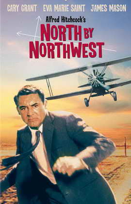 Comparing Taken to the poster from thriller classic North By Northwest it is varies in many respects. They are both similar by that they feature the main character in the foreground of the poster making them easily noticeable and connotates that they are the most important feature of the feature. However with the modern-day thriller Taken the use of colour is very different in the North By Northwest movie poster there is lots of vibrant colours appealing to the late 50's era whereas in Taken there is a desaturation of colour with darker colours e.g. greys and black combined with contrasting brighter colours to make certain aspects stand out. In the older posters they use full colour to make the whole thing noticeable, with the poster being in full colour it suggests maybe a more light-hearted style thriller possibly appealing to the whole family.
If we look to the back of the poster we see a woman (to the right of the hero) with a telephone to her ear, she does not seem distressed i.e. like a princess-type character but possibly a donor character to help the hero along with his quest by giving him/ aiding him with her personal skills or even a special item which will give him an advantage against the villain. Alternatively she could be the dispatcher who is the person setting the hero off on his mission however given that the movie is about a man looking for his daughter then it is more likely the hero himself is also the (self) dispatcher.
On the poster the creators use ‘expert witnesses’ as a way of promoting the poster calling it “the best action flick since Bourne” suggesting that the movie isn't necessarily your stereotypical action thriller, this in turn will engage the audience making it more attractive for them to go and see it.
The messages on the poster are a mixture of visual and written. Through the costume of the protagonist it communicates with the viewers of the poster the style of the movie. A message is also given across through the use of the bold words on the tagline such as “TAKEN” “HUNT” “FIND” “KILL” these words suggest deceit and murder all themes of a thriller that would appeal to their key audience as these films show situations which ordinary people wouldn't get to experience such as guns, fast cars etc. The specific words are in a different colour (white) so that they stand out, this also gives the audience a sense of how they link together including how they link to the story.
If we look at the second poser from Taken, this one is more likely going to be used for promotions after release as it quotes far more bout the film as the one above does. In this poster the character is again (stereotypically) up front and the only person featured in the image. What we see first on here is that the character is hidden behind the 'tagline' on the feature. The tagline reads "I DON'T KNOW WHO YOU ARE... BUT IF YOU DON'T LET MY DAUGHTER GO... I WILL FIND YOU... AND I WILL KILL YOU" which adds to the atmosphere of the overall poster, combined with the minimal lighting gives a sense of grieving for his daughter, it makes you empathise with the character and hope that the can get her back. For those who have seen the movie it will be a well known phrase which is instantly associated with the first Taken movie. The colour orange is used for the title which instinctively draws attention to the name of the movie as this is a colour best associated with drawing peoples attention; it has high visibility (especially on a black background) and symbolises endurance as well as strength.
Comparing Taken to the poster from thriller classic North By Northwest it is varies in many respects. They are both similar by that they feature the main character in the foreground of the poster making them easily noticeable and connotates that they are the most important feature of the feature. However with the modern-day thriller Taken the use of colour is very different in the North By Northwest movie poster there is lots of vibrant colours appealing to the late 50's era whereas in Taken there is a desaturation of colour with darker colours e.g. greys and black combined with contrasting brighter colours to make certain aspects stand out. In the older posters they use full colour to make the whole thing noticeable, with the poster being in full colour it suggests maybe a more light-hearted style thriller possibly appealing to the whole family.
I'll start with this one, as the improvements to the Kill Bill poster. While the inclusion of an alternative Taken poster and North By Northwest enhances the work, you're only really halfway there in terms of improving the level.
ReplyDeleteHTI:
Get your theories straight - I think you've missed something with uses and gratifications. Look at how you can apply Maslow's hierarchy of needs.
Comparison to NBNW needs to be a lot stronger and more focused on the representation of the protagonist and the narrative. Think about the sense of jeopardy we get from the image of Cary Grant compared to the image of Liam Neeson. Also consider 'star power'.