Showing posts with label G321 Poster Analysis. Show all posts

Monday, 20 October 2014

IMPROVED: Poster Analysis Kill Bill Vol 1

_______________________________________________________________

Excellent work, Russell, in terms of the precise and well argued consideration of the technical and symbolic codes. In those areas, I would consider this a B with potential for a higher grade if all criteria were met (see HTI below). You have attempted to link some theories and used terminology appropriately, showing Good work in this area (C) . It was good to reference a different poster for the same film and compare.

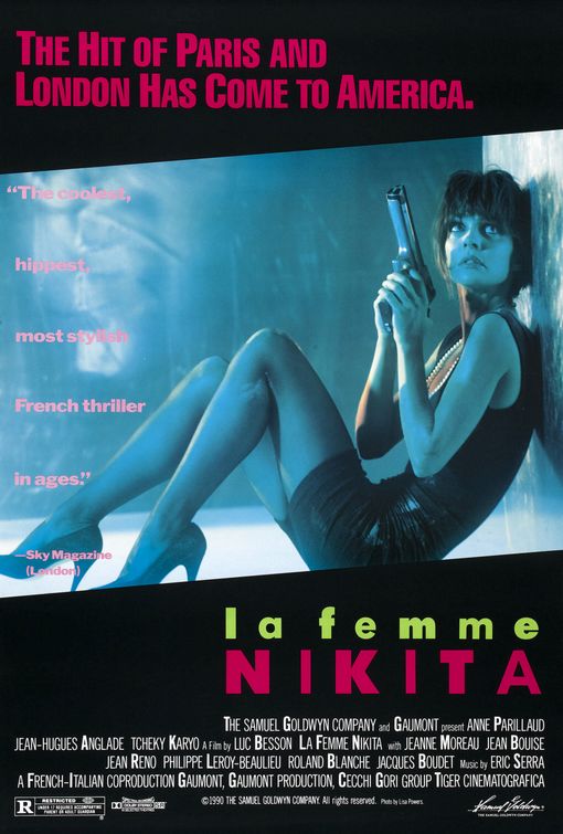
HTI - again, reference to other texts has been missed - this is essential - so you must find other, older posters within the genre. I would suggest La Femme Nikita, because the other thing you must do is write about the gender representation issue, in the sense that The Bride is both stereotypical and unique. Can you, for instance, link the choice of weapon to the idea of femininity versus masculinity?
_______________________________________________________________

Poster of Kill Bill Volume 1,
used on cinema release
Stereotypically, conforming to the thriller genre this poster of 'Kill Bill' presents the hero character in the centre and to the front of the image, making her more noticeable on a plain background. This establishes a relationship between the viewer and character in the poster early on before they have even watched the movie. The character is using direct address in the picture singling out the viewer, making it seem unique towards them, it looks as though she is judging you. On an initial glance the first thing you notice is definitely the bright yellow colour scheme, this colour symbolises energy, action excitement and most relevant caution. This use of colour represents the character known as 'the bride' suggesting that the antagonists should be cautious and watch out for her. You can also see a black strip along the background of the poster which symbolises power, elegance, death, mystery, strength and authority all these can also be applied to the character of 'the bride' as from the whole movie we learn very little about her only her reason for revenge. With the mixture of yellow and black it gives the image of a bee and it's stripes giving off a warning.
The tagline "A ROARING RAMPAGE OF REVENGE" adds to the excitement and intensity of the title of the film 'Kill Bill' it lets the audience get a better grasp as to what the film is about maybe even suggesting who 'Bill' is. The colour of the tagline is in red (capital) letters symbolising blood. This connotates pain, revenge, hatred, danger and alternatively romance which in the film we find out about the brides' relationship with Bill. To apply Todorov's narrative theory the title of the movie suggests that it is already in a state of disequilibrium in which the protagonist (the bride) needs to sort out for herself. Mixed with the name of the character and the idea of a 'rampage' gives off an unusual thought that a bride would be in such a situation, this suggests that with the film all is not what it seems.

The jumpsuit (also yellow and black) is designed like leathers for a motorbike – giving the character a rebellious and fearless look of nature to her. This combined with her facial expression gives her the image of power.


Another thing which is really noticeable is the character in the poster is holding a samurai sword (Katana), this relates directly to a, the storyline and b, to its director Quentin Tarantino who is renound for his love of Asian culture. The sword connotates power and authority. This could be considered a bit unusual to have such an item in a thriller movie, as the majority have high-tech guns. Some might also suggest that it is unusual for female characters to have weapons in this type of movie as stereotypically they aren't the hero. Most people would assume the style of weaponry to be very masculine (such as samurai fighting) although for those who see the film they will realise this is the main weapon used throughout.

Teaser poster of Kill Bill Volume 1,
used initially to promote the film
before release.
All factors which are featured in this film – it gives a lot away about what might relate to this film. In red is also ‘Volume 1’ which draws attention to this text and implies that this is the first of a series or the first instalment to this particular story, engaging the audience to maybe think about other sequels.

In this other poster (to the right) it has the same colour scheme as the final poster but this could be considered as one of the teaser posters before launch. The tagline on this one however related to the unusual style of the thriller with the words "HERE COMES THE BRIDE." this is similar to a play on words in which instead of it being used in the 'traditional' sense it is interlinked with the idea of revenge that the antagonist 'Bill' is suppose to fear her. You can see this in silhouette of the ninja quite clearly not the 'typical' bride.

Overall this poster is simple but effective, it is clean and streamlined, the simple bold colour scheme makes it easy to navigate as well as setting a picture in peoples minds (i.e. they will remember it in the future).

Poster from thriller
La Femme Nikita (1990)
Comparing Kill Bill to that of the movie 'La Femme Nikita' they portray women contrastingly. In Kill Bill they show the female character as a strong heroic type person with the weapon confidently being held by her, it looks like she means business and she knows what to do with the Katana. The Bride is in the stance as though the person viewing the poster should be begging for mercy in the photograph in the first poster she is clearly in control of the situation. Even in the second Kill Bill poster although this is not a real picture of her the silhouette is in a fight position prepared for combat.

Whereas if we compare these posters to the that of La Femme Nikita women are portrayed completely different. In the main image of this feature we see what is presumed the main character in a curled up position. They way that the gun seems huge compared to her suggests that she may not be fully aware on how to use it. It is also noticeable that she is not in the right clothes for a hero in a thriller, she is dressed in formal wear (a black dress and heels). It could be argued that the black dress is symbolising her elegance but it could also be argued that it is foreshadowing her future career as an assassin (i.e. death and mystery).

The shot that they have used in Kill Bill Volume 1 is a long shot used to show the full figure (outfit) of the Bride. It also allows the viewers to see all of the hero as to make early interpretations of the character. Conversely the shot used in La Femme Nikita is at the same height as the hero, it is still technically a long shot as you can see all of the figure however it is similar to a point of view (POV) shot making it as though we are there in the situation with the character, makes it seem as though we are hiding down there with her. She is looking at something, presumably dangerous behind is, this again can spark debate as to what it is she is staring at.

From the stance that she is in (bent hiding on the floor behind a wall) suggests that she is in a weak position looking up frightened as to who may be after her. For a female charter it is typical for Nikita to appear more vulnerable waiting for help (stereotypically from a masculine character). However this is unconventional for a 'hero' character as they are typically represented strong and prepared, such as the Bride in Kill Bill which for a female lead role is unconventional and unique both in the terms of style and story.

Sunday, 19 October 2014

Poster Analysis World War Z

This is a poster analysis for World War Z. This poster conforms to stereotypical conventions of a poster in the thriller genre. The theme of this poster is chaos, in the image we see a post apocolypic world in which zombies have taken over Earth, the urban location is a typical element of a thriller movie suggesting action which is a mus have for all thriller movies (i.e. chase scenes, alley way fights etc.) In the foreground of the poster we see Brad Pitt who is the hero in the film he is positioned in front of the sun giving the illusion that the light is coming from him connotating purity, maybe suggesting that he is the hope for the planet, notice that he is surround by darkness possibly foreshadowing the demise of humanity (or the infection) closing in on him.

Unusually the character is on his knees kind of leaning over looking down on the city, this could suggest that he will have difficulty in restoring the equilibrium to the story. By being on his knees it shows weakness and vulnerability as typically the hero is seen standing up in a bold position ready to fight.

On the poster there is little writing suggesting that this is a teaser poster used when the movie is being previewed in cinemas. The use of the title is a play on words, even thought people are unlikely to have seen the movie at this stage they make it obvious that it is about zombie with the use of Z representing the word zombie. The white text of the title symbolises purity innocence and life with the contrasting red Z symbolising evil, pain blood and war, with the faded serif font it gives an idea of age and decay.

If we compare this to another recent thriller, the poster from the Purge it is very different in the since that if we look at the image for the other movie it is very usual and does not conform to typical thriller features. The idea of the poster is to mimic the the American Flag which is associated and can be understood by any audience, it suggests the location of the film. To people who have seen the previous movie they will recognise both the use of the flag and the amalgamation of the red stripes and weapons. The redness looks like graffiti being sprayed on to a canvas, suggesting criminal acts which is ideally what the film is about. The use of the tagline 'AN AMERICAN TRADITION' establishes time to the poster making the viewer possibly go back and watch the older film. The colours are patriotic again going back to this idea of it being a tradition (blue suggesting loyalty, trust, peace and authority).

The tagline for The Purge also suggests that the movie is one of a series, if it is seen as a 'tradition' then it suggests future movies as well; as oppose to World War Z which is more likely to be a one-off film. 

This does not have any character type featured in the poster which is unusual for a thriller, simply thought the flag suggests it is representing the whole of the USA as one.

IMPROVED: Poster Analysis Taken

_______________________________________________________________

"Top work, Russell, a really thorough analysis that approaches the work from the viewpoint of key media concepts and names theories in places. In the inevitable second draft (everyone will do one), I'd need to see closer reference to the text as evidence, for example, how is the character representing authority? Are we sure he is representing authority, or would a more deviant (uses and gratifications) reading suggest otherwise? What evidence is there that the woman might be a donor (or maybe even a dispatcher)?"
_______________________________________________________________


In the poster ‘Taken’ there is an overall theme of mystery, which conforms to one of the stereotypes of thriller movies. The poster overall doesn't feature any bright colours, giving the viewer the impression the character is likely to be in a serious ‘redemption’ situation.

The main image shows the protagonist. The image is central and in front of most items situated in the poster, this makes him stand out from the plain grey background.
The character on the poster conforming to thriller movies is the hero, possibly in this case a bit of a vigilante. The clothes the hero is wearing gives the idea of concealment and mystery through the dark plain clothes which actually goes against the typical image of a hero character in most films, combined with his profile of half of him in the shadows, this possibly suggests that there is more to him than meets the eye and again going with the idea of possibly a vigilante style character.

A main theme is this (and other thriller posters) is the use of weaponry in the photograph it portrays a masculine styled movie with the female characters situated in the background of the poster, by displaying this prop it immediately shows the genre of the film and allows the audience to build up expectations before watching the film. Perhaps if we relate to Propps’ character types she could be the princess, stereotypically the prize at the end of the movie if not maybe some sort of donor to help the hero along his quest as this is stereotypical for thriller movies i.e. this is how the mass population will interpret it, authority is represented positively, this borders onto the Marxism idea of audience models. Through the hero having his pistol half drawn this suggests and element of action and quite possibly a disequilibrium in the story which he hopes to rectify with the use of that gun. We could also argue that the hero actually looks quite deviant in this first picture with a look of gratification showing that he has some personal emotional happiness that he has/ or will fulfil his goal.

If we look to the back of the poster we see a woman (to the right of the hero) with a telephone to her ear, she does not seem distressed i.e. like a princess-type character but possibly a donor character to help the hero along with his quest by giving him/ aiding him with her personal skills or even a special item which will give him an advantage against the villain. Alternatively she could be the dispatcher who is the person setting the hero off on his mission however given that the movie is about a man looking for his daughter then it is more likely the hero himself is also the (self) dispatcher.

On the poster the creators use ‘expert witnesses’ as a way of promoting the poster calling it “the best action flick since Bourne” suggesting that the movie isn't necessarily your stereotypical action thriller, this in turn will engage the audience making it more attractive for them to go and see it.

The messages on the poster are a mixture of visual and written. Through the costume of the protagonist it communicates with the viewers of the poster the style of the movie. A message is also given across through the use of the bold words on the tagline such as “TAKEN” “HUNT” “FIND” “KILL” these words suggest deceit and murder all themes of a thriller that would appeal to their key audience as these films show situations which ordinary people wouldn't get to experience such as guns, fast cars etc. The specific words are in a different colour (white) so that they stand out, this also gives the audience a sense of how they link together including how they link to the story.

If we look at the second poser from Taken, this one is more likely going to be used for promotions after release as it quotes far more bout the film as the one above does. In this poster the character is again (stereotypically) up front and the only person featured in the image. What we see first on here is that the character is hidden behind the 'tagline' on the feature. The tagline reads "I DON'T KNOW WHO YOU ARE... BUT IF YOU DON'T LET MY DAUGHTER GO... I WILL FIND YOU... AND I WILL KILL YOU" which adds to the atmosphere of the overall poster, combined with the minimal lighting gives a sense of grieving for his daughter, it makes you empathise with the character and hope that the can get her back. For those who have seen the movie it will be a well known phrase which is instantly associated with the first Taken movie. The colour orange is used for the title which instinctively draws attention to the name of the movie as this is a colour best associated with drawing peoples attention; it has high visibility (especially on a black background) and symbolises endurance as well as strength.


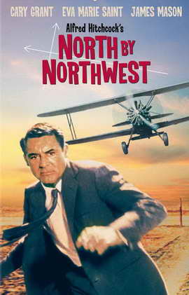
Comparing Taken to the poster from thriller classic North By Northwest it is varies in many respects. They are both similar by that they feature the main character in the foreground of the poster making them easily noticeable and connotates that they are the most important feature of the feature. However with the modern-day thriller Taken the use of colour is very different in the North By Northwest movie poster there is lots of vibrant colours appealing to the late 50's era whereas in Taken there is a desaturation of colour with darker colours e.g. greys and black combined with contrasting brighter colours to make certain aspects stand out. In the older posters they use full colour to make the whole thing noticeable, with the poster being in full colour it suggests maybe a more light-hearted style thriller possibly appealing to the whole family.

Thursday, 16 October 2014

Poster Analysis Kill Bill Vol 1

Poster of Kill Bill Volume 1,
used on cinema release
Stereotypically, conforming to the thriller genre this poster of 'Kill Bill' presents the hero character in the centre and to the front of the image, making her more noticeable on a plain background. This establishes a relationship between the viewer and character in the poster early on before they have even watched the movie. The character is using direct address in the picture singling out the viewer, making it seem unique towards them, it looks as though she is judging you. 

On an initial glance the first thing you notice is definitely the bright yellow colour scheme, this colour symbolises energy, action excitement and most relevant caution. This use of colour represents the character known as 'the bride' suggesting that the antagonists should be cautious and watch out for her. You can also see a black strip along the background of the poster which symbolises power, elegance, death, mystery, strength and authority all these can also be applied to the character of 'the bride' as from the whole movie we learn very little about her only her reason for revenge. With the mixture of yellow and black it gives the image of a bee and it's stripes giving off a warning.

The tagline "A ROARING RAMPAGE OF REVENGE" adds to the excitement and intensity of the title of the film 'Kill Bill' it lets the audience get a better grasp as to what the film is about maybe even suggesting who 'Bill' is. The colour of the tagline is in red (capital) letters symbolising blood. This connotates pain, revenge, hatred, danger and alternatively romance which in the film we find out about the brides' relationship with Bill. To apply Todorov's narrative theory the title of the movie suggests that it is already in a state of disequilibrium in which the protagonist (the bride) needs to sort out for herself. Mixed with the name of the character and the idea of a 'rampage' gives off an unusual thought that a bride would be in such a situation, this suggests that with the film all is not what it seems.

The jumpsuit (also yellow and black) is designed like leathers for a motorbike – giving the character a rebellious and fearless look of nature to her. This combined with her facial expression gives her the image of power.

Another thing which is really noticeable is the character in the poster is holding a samurai sword, this relates directly to a, the storyline and b, to its director Quentin Tarantino who is renound for his love of Asian culture. The sword connotates power and authority. This could be considered a bit unusual to have such an item in a thriller movie, as the majority have high-tech guns.

Teaser poster of Kill Bill Volume 1,
used initially to promote the film
before release.

All factors which are featured in this film – it gives a lot away about what might relate to this film. In red is also ‘Volume 1’ which draws attention to this text and implies that this is the first of a series or the first instalment to this particular story, engaging the audience to maybe think about other sequels.

In this other poster (to the right) it has the same colour scheme as the final poster but this could be considered as one of the teaser posters before launch. The tagline on this one however related to the unusual style of the thriller with the words "HERE COMES THE BRIDE." this is similar to a play on words in which instead of it being used in the 'traditional' sense it is interlinked with the idea of revenge that the antagonist 'Bill' is suppose to fear her. You can see this in silhouette of the ninja quite clearly not the 'typical' bride.

Overall this poster is simple but effective, it is clean and streamlined, the simple bold colour scheme makes it easy to navigate as well as setting a picture in peoples minds (i.e. they will remember it in the future). 

Tuesday, 30 September 2014

Poster Analysis - Taken

Poster for the first 'Taken' film.
In the poster ‘Taken’ there is an overall theme of mystery, which conforms to one of the stereotypes of thriller movies. The poster overall doesn't feature any bright colours, giving the viewer the impression the character is likely to be in a serious ‘redemption’ situation.

The main image shows the protagonist. The image is central and in front of most items situated in the poster, this makes him stand out from the plain grey background.

The character on the poster conforming to thriller movies is the hero, possibly in this case a bit of a vigilante. The clothes the hero is wearing gives the idea of concealment and mystery through the dark plain clothes which actually goes against the typical image of a hero character in most films, combined with his profile of half of him in the shadows, this possibly suggests that there is more to him than meets the eye and again going with the idea of possibly a vigilante style character.

A main theme is this (and other thriller posters) is the use of weaponry in the photograph it portrays a masculine styled movie with the female characters situated in the background of the poster, by displaying this prop it immediately shows the genre of the film and allows the audience to build up expectations before watching the film. Perhaps if we relate to Propps’ character types she could be the princess, stereotypically the prize at the end of the movie if not maybe some sort of donor to help the hero along his quest as this is stereotypical for thriller movies i.e. this is how the mass population will interpret it, authority is represented positively, this borders onto the Marxism idea of audience models. Through the hero having his pistol half drawn this suggests and element of action and quite possibly a disequilibrium in the story which he hopes to rectify with the use of that gun.

On the poster the creators use ‘expert witnesses’ as a way of promoting the poster calling it “the best action flick since Bourne” suggesting that the movie isn't necessarily your stereotypical action thriller, this in turn will engage the audience making it more attractive for them to go and see it.


The messages on the poster are a mixture of visual and written. Through the costume of the protagonist it communicates with the viewers of the poster the style of the movie. A message is also given across through the use of the bold words on the tagline such as “TAKEN” “HUNT” “FIND” “KILL” these words suggest deceit and murder all themes of a thriller that would appeal to their key audience as these films show situations which ordinary people wouldn't get to experience such as guns, fast cars etc. The specific words are in a different colour (white) so that they stand out, this also gives the audience a sense of how they link together including how they link to the story.