Saturday, 7 February 2015

Use of Colour

Screenshot showing the character in the yellow
hoodie foreshadowing the death of the victim.
Use of shadows to this scene more
mysterious, it adds to the enigma of the storyline.
Use of saturated colours to make the shot
more vibrant.
Desaturated camera shot at the beach. The black and
white references the US Thriller Psycho. 


In the production of our thriller we decided to effectively use colour for impact. The use of colour is representative of the main character's life. To begin with the scene at the party we saturated the bright colours in shot to make it vibrant and alive. This gave the idea of strobe lighting as well as making the actors stand out (in contrast) to the pitch black background in that scene. This scene with the bright colours is designed to represent the life of the victim which at this time is complete and radiant. We used colour thorough the costumes of our characters. One of the friends in the party scene are wearing a yellow hoodie-style jumper. We used him to portray future events of the main character. This colour connotates happiness, joy and energy (reflective of the protagonist) however this colour also represents caution and warning which foreshadows her untimely demise later on in the scene. 

The variation shot of this is at the beach scene where we adapted the use of black and white shots from the 1960's thriller Psycho. In this film although it is in black and white it relies on other things to suggest elements of the story to the audience. it was from analysing the famous shower scene that we got the inspiration of referencing this great film. For these angles on the beach we desaturated all colours from the picture making it seem incomplete, vacant as this is where the audience will see the victim being dragged along the beach, the use of colour is representative of the victims life, when it flashes between the two narratives the absence of colour shows that she has gone.

The desaturated shots are unconventional as typically they show events in the past, however, with our thriller it in fact represents the present (the morning after the party).

Along with colour (again taking inspiration from Psycho) we decided to use shadows to add tension to the scene. In the shot where the victim is being taken by the villain we use the shadows to show him creeping up on her keeping the identity a mystery which is an enigma which could be followed throughout the whole film.


Friday, 30 January 2015

Camera Types


We used a GoPro to film all of our thriller because it allowed us to film in 1080p which is much better quality than the cameras given to us by the College and colours will be much more vibrant when needed and the scenes where we filmed at night should be much crisper. The specific model is a GoPro Hero 3+ with a variety of accessories, for example a waterproof case, extendable arm, chest mount and tripod. These allowed us to film using a variety of camera angles and movements which the normal cameras could not achieve.

Being able to use the GoPro in the sea was very important as we could create a sequence of POV shots under the surface of the water and then bring the camera above it to create the effect of drowning. Also, a wave crahses into the camera and then fades to black to emphasise the end of the sequence which couldn't of been done with a normal camera. These scenes make our thriller opening sequence unique compared with the other groups and the ocean theme is popular in many thriller films for example Jaws (see setting inspiration) which is explained in a different post.

Influences For Setting


We have used a variety of themes, props and costume from other thriller films to insure that our opening sequence is as good as it can be and our audience are going to enjoy it. By doing this, our thriller opening scene looks more professional and more people are going to want to watch it. Firstly, we used the coast as one of our two main settings which is surprisingly common in thriller films. For example, in Inception, the main protagonist washes up on the beach out of no where showing how the ocean is mysterious and uncontrollable. Also, it shows the edge of land and if you look out to sea, you can see nothing. This links to how it is mysterious but it could be argued that the ocean is a force out of our control and it cannot be tamed. Another reason we used the coast was because it is common in thrillers to have a dead body wash up on the beach and we attempted to replicate part of this by having our victim thrown into the sea.


Another film which uses the ocean as a main setting is Shutter Island but this is due to it enclosing the characters and trapping them onto the island with no escape. The high cliffs and large waves are seen with long shots out to sea showing how there is no escape and no life around. By showing the waves lapping over the camera and it then dipping under waves, our audience feel the same entrapment as the camera angle could be a POV of the victim drowning. Also, a long shot pans across the beach showing the high cliffs and this makes the audience feel scared as they are much taller than the characters, trapping them in with no escape due to the sea being on one side and the cliffs being on the other.


The last thriller film which encouraged us to use the coast and mainly the sea as a setting was the film Jaws, made in 1975. Basing parts of our thriller around older, classic thrillers widens our audience and classic thrillers such as Jaws and Psycho contain very different, simplified themes compared to the modern thriller films. Also, they are filmed in a very different way which is interesting as it allows the audience to compare these films of different times. In Jaws, the antagonist is a shark which is non-stereotypical yet works very well as you never really fully see it yet the audience can sense its presence due to factors such as sound and lighting. But more specifically, they have used the ocean as a main theme as the antagonist is hidden in it linking to how there are hidden dangers and evil things lurking below the surface. In our thriller, we have attempted to give the ocean connotations of mystery and incredible power as the victim is drowning on show to the audience who can do nothing about it. One of the scenes in Jaws shows loads of children running out of the sea as someone has been bitten by a shark. The audience feel the urge to help all of the struggling children who could die however it is physically possible.


Tuesday, 27 January 2015

Use of sound

Inspiration:

This is the soundtrack we created for our thriller opening sequence which was influenced by music from Batman the Dark Knight composed by Hans Zimmer. We used Garageband to compose what we believe is a typical thriller backing track. We based it on the Bank Heist music from The Dark Knight because it was a very eery and added tension to the scene in certain areas. For example, the camera zooms to a glass building and the audience are expecting something to happen and then one of the windows smashes. Even, when you watch it again you are trying to locate the right window. My music is very similar throughout, as different sounds have been combined to create a constant droning with some added sci-fi themed noises to break the tension. The soundtrack is the only sound that is apparent in my film and this makes it very effective as there is a party going on, however the music is very tense and mysterious to foreshadow evil and death.

Other sound effects including the car boot slam and the waves at the beach were also done on Garageband. We found lots of different sounds which fitted into our opening sequence and then applied them. It allows the audience to feel like they are more engrossed in the sequence and due to the non-existent dialogue, these new sound effects are a welcome break from the backing track. For example, the tension is broken when the boot is slammed shut and the antagonist walks away, which is the first time you see his face fully. Also, the addition of the sounds from the coast add to the realism of the sequence as the audience think it is more believeable.


Use of sound:

Non-diegetic sound is important in our thriller opening sequence because it builds tension throughout the duration of the scenes with added emphasis on specific shots which are more important than others. For example, when the boot shuts on the victim there is a deep echoing 'thump' that conveys the protagonists entrapment. Also, another use of emphasis is the medium shot where shadows are used to denote the victims capture. It sounds similar to water being sucked away as the antagonist approaches the victim and this adds tension to the scene, meaning the audience know that it is important to the storyline. Then, after the credits have appeared, a sudden distorted synth sounds which is quite unnerving as the audience see the victim drop below the surface of the water for a final time conveying her death and the end of the sequence.

Diegetic sound is also important in our thriller due to it being significant sounds which the characters can hear. A good example of this is the noise of the sea which is paramount to the rest of the title sequence. Secondly, the tension is at its highest point during the POV shot of the victim drowning amongst the waves because it shows her struggle and the fact that the audience are unsure if she is dead or not. Furthermore, the music ends abruptly presenting the disturbance of the equilibrium and her possible death.

Friday, 23 January 2015

Secondary Research - British Film Industry

In addition to primary data which I collected and analysed from my questionnaire analysis and research I have also decided to do some secondary research on the BFI regarding the Thriller genre. This research is collected from the BFI website statistical data. This is a use of secondary data to see which films genres are most popular as recorded by the BFI themselves. 

Going first of all by gender I have fount from the BFI's statistics  that "A wide range of genres appealed to women, whereas action films, comedies and thrillers were popular with men". Therefore this suggests that for a thriller movie opening it would pay off to be more male orientated since it is one of the top 3 most popular genres for males. 

In Figure 11.4 it shows you the overall breakdown for the percentage of sales collected by each genre as a whole. The most popular genres (as expected) are Action/ Adventure, Comedy and Dramas with over 60% of the total sales for 2013. Thriller is the 5th most popular genre in the table with 8.3% of sales in terms of movies released for that year. 

My second screenshot in Figure 4.1 we are looking at specifically 'films in the UK and Republic of Ireland by genre' (2013) gross by the box office. In this table thriller and thriller movies are ranked much lower than the sales breakdown. Most popular films in this instance were animation films (Despicable Me 2) making £246.6 million that year. For the UK box office thrillers were ranked place 12 with a gross profit of £29.1 million and the top performing film as Prisoners. This is because genres such as animation, action and comedies have alot more appeal to the younger and family groups, they are a much more 'all round' genre which everyone will enjoy as oppose to the thriller genre which is stereotypically more of a masculine genre. 


Monday, 12 January 2015

Psycho Scene Analysis

http://www.youtube.com/watch?v=8VP5jEAP3K4

Screenshot from the point at which the audience can
see the figure of the murderer in the shower curtain.
Most noticeable is the effective use of non-deigetic sound for this scene i.e. the backing track which characters cannot hear.  To begin with the sound is calm and in a state of equilibrium when the woman is writing a letter. This then starts to change and distort when she enters the shower, it continues to change as the viewer can begin to see the shadow of the murderer in the shower curtain. The sound completely changes when the curtain opens and villain is shown, it goes to a sharp high pitched striking sound, it is the audio representation of the knife which the murderer is using. The use of this non-diegetic sound is to keep the audience in suspense for the whole scene making them feel unsettled and convey a sense of disequilibrium (Todorov's Narrative Theory). Once the murderer had killed the victim and left the apartment the music then begins to return to the original state of equilibrium as the tension has passed. Since there is no dialogue in the scene the clip relies totally on sounds & it's famous backing track.

The use of the weapon (knife) adds to the effect of the scene. With it being a manual weapon it gives more effect to the scene by adding suspense, 'will the character manage to fight back?' It also gives us the silhouette of the murder from when he opens the shower curtain, shocking the audience, this would not have the same dramatic climax if the weapon of choice was a gun.

Close up shot of the villain, his face is hidden in
the shadows to add mystery to the scene.
There is also a use of black and white to connotate who is good and evil. It is clear from the use of shadows who is the villain character (according to Propp's Character Types). It is clear from the scene that the woman is the victim. Even when he pulls the shower curtain you cannot see his true identity as his face is hidden from the light, by doing this is gives him an element of mystery,  it allows the viewers to be held in suspense as to who he could be.

Close up shot typically used to convey emotion of
the character.
The use of camera angles is additionally a key aspect of the scene. The use of the high angle of the woman when she is in the shower signifies her as the victim. A high angle shot is used to make the character in view appear vulnerable, it can also foreshadow that there will be a disturbance of the narrative. The other camera angle which is significant is towards the end of the scene where there is a use of an extreme close up as the camera then pans away to show her face. This use of a close up is to convey emotion (i.e. fear) to the audience, it suggests to them that the character is dead without actually saying or showing any gore.

Monday, 15 December 2014

Scene Analysis - Bank Robbery Scene - The Dark Knight (2008)

Chttp://www.youtube.com/watch?v=0OYBEquZ_j0


In the bank robbery scene from The Dark Knight there is a large use of Mise-en-scene to convey the characters in shot. It shows who is good and who is bad.

This extract expresses Mulveys theory of 'Male Gaze' in the sense it is from a heterosexual male's point of view, it is from the point as if the viewers are one of the bank robbers. By doing this is will hugely appeal to the target audience through the use of Mise-en-scene as it's conventions of character and storyline primarily will target young/ middle ages men. This can be expressed though their use of over the shoulder shots and long shots. This conforms to not only the thriller genre but to how media is represented in general. 

The use of setting is stereotypical for a film of the thriller genre. The urban setting is used highly as it's immediate connotations are that a city is busy and full of action; very popular among crime thrillers, such as the Dark Knight. A similar film which use this kind of location of effect would be Jake Reacher. Additionally making a bank scene the primary location of the film immediately conveys character types, it is obvious that the masked men are bank-robbers i.e. the 'bad guys'.

The use of the masks in this scene is highly effective and alternatively ironic. By having a clown mask for such a task as robbing a bank it unusual and in some cases 'funny'. This is not something you would expect from people robbing a bank as they are hidden but also stand out. It also adds a sense of enigma to the scene as we do not know who is behind the faces. We assume from the use of hidden identity and their reckless behaviour that they are the villains according to Propp's character types. People who are familiar with the Dark Knight movies may identify the characters to a villain as henchmen from their costume.

Continuing with the costume of the villains they are all wearing similar purple suits. This is to help identify they are with the villain (purple being the Joker's iconic colour). Purple connotates Wealth, Money, riches, royalty, all things which link in with the style of robbers (i.e. the Joker's theme). Additionally it symbolises  power, mystery and ambition all things which link to that particular villain. The colour purple is a very rare colour in nature; some people consider it to be artificial, maybe suggesting that not everything is as it initially seems.

Generally there is Masculine theme, they are primarily male characters in the scene and are armed with guns as well as explosives; the guns represent power and authority by the masked villains. Again this will appeal to the audience as these movies are watched to see characters such as criminals and their perception of the law. People watch film such as the Dark Knight as they get a sense of a side of life they do not ordinarily experience additionally they enjoy seeing people being brought to justice especially by a vigilante type character such as Batman (the hero).

As this is early on in the film there is a use of the backing track to create an atmosphere of equilibrium - according to Todorov's narrative structure. However the music is also a ticking noise which suggests that something is about to happen, it is used to create a source of tension so that the viewers of the film are being pro-active to see what is going on in the city. The use of diegetic sound i.e. the breaking of glass represents the disturbance in equilibrium  as it is where the tone of the film changes. It goes from a state of equilibrium to disequilibrium and ultimately chaos. We can tell this from the change in the sound of music and that the camera diverts from introducing the city to following the story of the bank robbers.


Monday, 8 December 2014

Primary Research - Audience Analysis


The survey was distributed on Wednesday the 11th of November. The survey was conducted on survey monkey as it was easy to send to people as well as collect the results. From doing it in this format it has been very beneficial with a total of 56 replies. Analysed on the 8th of December (see primary analysis task). Media g321 audience research
Example of my questionnaire can be found at https://www.surveymonkey.com/s/NFHJYZC

Monday, 17 November 2014

Preliminary Task


This is our preliminary task in which we have attempted to convey thriller stereotypes. Throughout the task, we encountered many filming/uploading failures. We had technology difficulties and ended filming four separate times and this meant we were rushed for editing of the task. To incorporate the conventions of the thriller genre, we used a variety of camera angles to represent power between the two characters. We created enigma by using this technique as the audience are unsure of which Propp's character types are represented by each character as the narrative unfolds. This alone intrigues the audience and creates a feeling of suspense and mystery, this is paired with the use of the non-diegetic sound to put emphasis on the tension represented in the clip.      

Saturday, 15 November 2014

Thriller Plan: Theo, Russell, Jake

Narrative/Plot

The thriller opening sequence follows a rave taking place in outside with a large group of teenagers with one main girl, strobe lights and music but a strange abnormal man is seen in the background wearing all black and a hood. The interweaving narrative cuts to the hooded figure dropping the girl into a car's boot and then driving to the coast where he drags her body along the sand to the sea. It carries on cutting back to the party through certain sounds and the same camera angles. Finally, the girl is thrown into the sea.


Camera angle examples

Long shots of the beach scene where the tracks are followed and time is skipped.
Close up of girl's face cutting between the party and her dead body being dragged.
Over the shoulder shot of the man dragging the girl.
Two shot of villian and victim at the party.
Canted angle of dragging along sand.
P.O.V of dragging and car but but also partying.
Birds eye view which rotates into other situation.


Costumes
The man is seen wearing all black clothes as this colour has connotations of evil, mystery and death.
The woman is seen wearing colourful party clothes which are mainly red.
Dress is covered in mud and blood because of the struggle which the audience do not see.


Props

  • A car and the use of its boot.
  • Strobe lighting.
  • Alcohol and food for the party.


Setting

The party is to be filmed outside in a garden.
We shall specify the beach nearer the time but it will probably be Cromer.
Party scenes will be shot at night.


Sound

Non-digetic sound includes a tense whining sound of strings such as the Batman Dark Knight opening sequence.
There will be no digetic sound as it will look much cleaner and add tension with no dialogic either because this is stereotypical of thrillers.

Actors

  • One large, scary man.
  • The victim who is a teenage girl.
  • 8 party extras who are teenagers.


We will mostly be using the GoPro to film as P.O.V shots will look very clean and it is very easy to move around and allows us not to borrow a school camera. Also, we can use it in the sea to get good angles and it can be put on a pole to get obscure angles.

Wednesday, 5 November 2014

Skyfall Opening Scene Analysis

http://www.youtube.com/watch?v=_4gdhsVKTcs


In this opening sequence we see a lot of gender representation, most notably in the first few seconds we see Bond fall into the water being pulled down into the darkness by a woman's hand, in this shot we see that the hand is much bigger than him. This is a representation that classically in the bond films although the men have the power they are easily controlled by women and their desires. It suggests that women are the corruption of men, this is shown by him being taken into darkness. Although you could argue that since he is drowning the female hand is actually his saviour from death.


In this shot we see cardboard cut-outs of Daniel Craig in the style of a target, the target has a wound on his right shoulder which is significant to the film as it is the symbol of his struggle for ideal health and is represented through  a new start for Bond. It is interesting that they show him as a target since this is how the villain considerer the character. The target comes towards the viewers making the sequence more interesting, it keeps their minds active as to what is going on as throughout the opening credits each mini scene is foreshadowing future events in the movie. The shot zooms in to the wound on the target, this is like we are seeing inside the hero's story. In the sequence the protagonist (James Bond) is dressed formally in a full suit and tie suggesting that this character has the capacity to make important decisions. In this case the fact that he is wearing a black suit (tuxedo) is typical for the hero (meaning Bond) to wear as he does in most films, it is the stereotypical looks for his character, the black for the protagonist is bold and dominant showing death to his enemies as well as confidence in his decisions. 

Dark and gloomy colours used in this shot are giving a sense that it in the past or a nightmare. The use of a dark blue connotates sadness and upset. The use of knives coming down from the sky shows the masculinity of the trilogy with each knife representing a past James Bond character which we then the shot pan over and zoom in where CGI is used to transform the daggers in to gravestones. These weapons are also naturally symbolic of betrayal deceit. 

The backing track to the scene is non-diegetic characters in the film wouldn't hear it, it is purely for audience reaction. The sound is the Skyfall theme song made especially for the film, the track acts as a narrator to what is going on the the film. This music gets much more intense as the credits come to an end awaking the audience for the rest of the film, it makes them want to see more of the film as it is immediately left on a cliffhanger. Additionally the increase in volume and intensity of the soundtrack suggests a disturbance in equilibrium  since both the opening credits and music is representative

in foreshadowing the events in the film. Visually this is through featuring locations of the film in the opening sequence for example the Chinese dragon foreshadowing his journey to China as well as a scene of a mansion with two deer's outside, this is foreshadowing the finale in the mansion where he was born 'Skyfall'.On the initially seeing this it would not become clear to viewers that these are the locations they visit however it then makes it seem recognisable later on in the film. 


Later in the title sequence we see Bond in an abandoned warehouse shooting down his own shadow, this is symbolic of his mental state throughout the film, fragmented and unsure of what it true. This on the other hands could be interpreted as him shooting his former self, something which he has to do in the film in order to become stronger and be 'reborn' as a better secret agent. 

The use of props is significant also to this film, one example being, the pistol with a silencer is a representation of Bond himself, these weapons add to the masculine theme of the feature.

The use of colour changes towards the end of the credits, this is going with the idea of tension mounting in the storyline. The colour goes from a dark blue to a red symbolising danger, aggression as well as passion. These are all things that fans and typical viewers would expect from a James Bond film. 

The fact that all these scenes are dark and blurred goes back to the idea of them being passed demons that have come back which Bond needs to deal with.

Monday, 3 November 2014

Godzilla (2014) Opening Credits Analysis

http://www.youtube.com/watch?v=NBQJjqnG1iI


In this thriller-opening scene for Godzilla it is unusual to conventional thriller credits. It shows what the movie is about however they way it does this is what makes it different. Instead of having actual people from the movie feature in the opening credits or in some cases CGI/ animation to make a scene this film used old styled footage and ancient anatomical drawings. By doing this it gives an ancient nostalgic feel to the film it is like the drawing are from a legend, drawings of what people thought they say thousands of years ago. This relates to the idea of it being Godzilla which has remained asleep underneath Tokyo for years. It also flicks through book titles, one of which is Charles Darwin's Origin of Species which of course those familiar with the film know that it is a mutant creature which would be unexplainable in regards to such as book. It also features news articles about submarines going missing and civil unrest all things which the creature causes. It is unusual that in this thriller the villain is actually a monster rather than a person or organisation, this for propp's character types could be considered unconventional. The hero's in this scene appear to be the military who are fighting to combat the 'villain' and save the city, which arguably could be regarded as the princess as the reward of it is the city being saved (as well as everyone living there).

Most shots used in this feature are standard mid-shots of the drawings however it also uses a birds-eye-view-shot to show the creature emerging from the ocean, this is used to give the viewers perspective of the size of Godzilla. Showing how everything else is insignificant compared to the enormity of the beast. By only showing the tail of the monster it adds mystery as it allows people to speculate as to what the creature actually is. It is also interesting looking at the camera style they have used in the scene all shots containing 'real' video is designed and edited to look as though it is old footage (like original setting of the film). You could say that the footage is similar to 'classified files' as though we as the viewers are seeing secret documentation. 

This is a long shot used to show all of the weapon (bomb). It is again used to show the entire thing, at first glance it is a nuclear weapon however it features a logo of Godzilla with a red cross around suggesting that it is specifically for defeating the monster. The colour of the bomb symbolises energy, caution, warning and most significantly decay which links in with the idea of it being a nuclear weapon.

The music in the opening credits of Godzilla start off so quiet it is hard to hear any background noise what so ever. Although as you go through the sequence the music intensifies and becomes more dramatic with loud noises and towards the end of the sequence we hear a man sounding a countdown (relating to the bomb) then we see the bomb being deployed, hearing it donate and go into the surroundings it then goes silent (with a slight ringing) and fades to white.

Tuesday, 21 October 2014

Jack Reacher - Opening Scene Analysis (Micro/ Macro)


In the beginning of this opening scene there is a build-up of tension, featuring around the assumed villain character, this shows that there is an imbalance of power between the criminals the the police, they are inferior and unaware of what is going on. This scene is accurate to a real life situation of terrorism in the film in which authorities have a lack of control over these situations since they don't know when such events will occur. The theme of the character could also reflect on recent events (current affairs) in America to which has had a large
debate on issues of gun control in schools, it is presumably gun enthusiast who is the sniper (possibly an assassin)  as it is clear he is a professional, this would conform to the idea of the man being a white American down to the setting (being able to freely have a gun). From the gunmen's stance with his sniper rested on the wall combined with the long procedure of setting up the weapon suggests that he is possibly ex-military getting his own back on the government as a protest against gun control and the rights to have guns in the US. We can also see that
from the first screenshot that the villain character is wearing white gloves, this again conforms to the idea that he is a professional assassins or even hit man either for personal revenge or as part of a larger organization. It is stereotypical for the villain character to be male in such crime thrillers. He is conventional in the sense that he is close shaven head and is wearing a jacket and jeans attempting to symbolize either a stereotype or to make them blend in. Although it is more common nowadays to have a female character to be a villain than it used to be they tend to have more stratified ways of murdering their victims (such as poisons) this scene in Jack Reacher with the character and weaponry suggests it is going to be a more masculine orientated movie. You could argue however that the character isn't conventional villain in the sense that he is not wearing the conventional colours of that styled character rather than wearing black he is wearing brown suggests practicality and intensity. It is also interesting to not that the (assumed) bankers/ politicians are all wearing black, since we are seeing things from the hit man's perspective this could suggest that he is seeing them as the evil beings rather than himself.
In this camera shot we get a clear shot down the gun scope at the businessman right in-between his cross hairs of the target, it is if you like a POV shot of the gun itself. This is a brief shot before a jolt in camera angle and the man is next dead on the bench, it creates heightened tension and in the build up makes the audience anxious at to who the villain is after. Through use of this camera shot it adds tension to the scene as we are seeing what he sees. It leaves the audience trying to guess who or what he is aiming for, with this shot the man goes over a few people again continuing the tension build up. The tension at it's highest when he then finds his target  this is the clear beginning of disequilibrium in the films narrative the man depicted with the gun is conventionally made to look like the villain as in this instance the person with the gun is set out to murder rather than protect.


The shot of the gunman's watch (brief as it is) suggests that he is organized and is waiting for a particular moment to strike, maybe when the police force is at its weakest or more likely when the target he is after is on a lunch break. The watch itself symbolizes time passing in the opening sequence intensifies the time it takes to get the targets, it makes the audience question what is going on, who it is the man is after, will the police stop him in time etc.

Monday, 20 October 2014

IMPROVED: Poster Analysis Kill Bill Vol 1

_______________________________________________________________

Excellent work, Russell, in terms of the precise and well argued consideration of the technical and symbolic codes. In those areas, I would consider this a B with potential for a higher grade if all criteria were met (see HTI below). You have attempted to link some theories and used terminology appropriately, showing Good work in this area (C) . It was good to reference a different poster for the same film and compare.

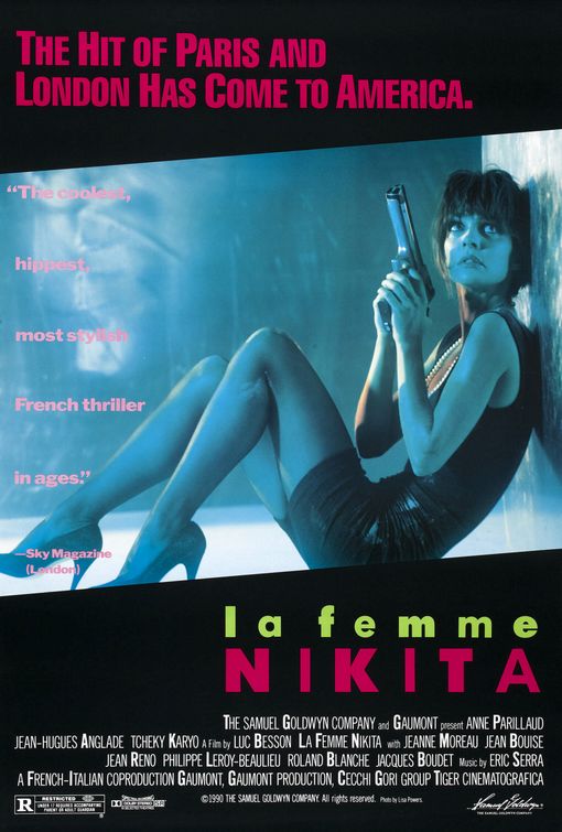
HTI - again, reference to other texts has been missed - this is essential - so you must find other, older posters within the genre. I would suggest La Femme Nikita, because the other thing you must do is write about the gender representation issue, in the sense that The Bride is both stereotypical and unique. Can you, for instance, link the choice of weapon to the idea of femininity versus masculinity?
_______________________________________________________________

Poster of Kill Bill Volume 1,
used on cinema release
Stereotypically, conforming to the thriller genre this poster of 'Kill Bill' presents the hero character in the centre and to the front of the image, making her more noticeable on a plain background. This establishes a relationship between the viewer and character in the poster early on before they have even watched the movie. The character is using direct address in the picture singling out the viewer, making it seem unique towards them, it looks as though she is judging you. On an initial glance the first thing you notice is definitely the bright yellow colour scheme, this colour symbolises energy, action excitement and most relevant caution. This use of colour represents the character known as 'the bride' suggesting that the antagonists should be cautious and watch out for her. You can also see a black strip along the background of the poster which symbolises power, elegance, death, mystery, strength and authority all these can also be applied to the character of 'the bride' as from the whole movie we learn very little about her only her reason for revenge. With the mixture of yellow and black it gives the image of a bee and it's stripes giving off a warning.
The tagline "A ROARING RAMPAGE OF REVENGE" adds to the excitement and intensity of the title of the film 'Kill Bill' it lets the audience get a better grasp as to what the film is about maybe even suggesting who 'Bill' is. The colour of the tagline is in red (capital) letters symbolising blood. This connotates pain, revenge, hatred, danger and alternatively romance which in the film we find out about the brides' relationship with Bill. To apply Todorov's narrative theory the title of the movie suggests that it is already in a state of disequilibrium in which the protagonist (the bride) needs to sort out for herself. Mixed with the name of the character and the idea of a 'rampage' gives off an unusual thought that a bride would be in such a situation, this suggests that with the film all is not what it seems.

The jumpsuit (also yellow and black) is designed like leathers for a motorbike – giving the character a rebellious and fearless look of nature to her. This combined with her facial expression gives her the image of power.


Another thing which is really noticeable is the character in the poster is holding a samurai sword (Katana), this relates directly to a, the storyline and b, to its director Quentin Tarantino who is renound for his love of Asian culture. The sword connotates power and authority. This could be considered a bit unusual to have such an item in a thriller movie, as the majority have high-tech guns. Some might also suggest that it is unusual for female characters to have weapons in this type of movie as stereotypically they aren't the hero. Most people would assume the style of weaponry to be very masculine (such as samurai fighting) although for those who see the film they will realise this is the main weapon used throughout.

Teaser poster of Kill Bill Volume 1,
used initially to promote the film
before release.
All factors which are featured in this film – it gives a lot away about what might relate to this film. In red is also ‘Volume 1’ which draws attention to this text and implies that this is the first of a series or the first instalment to this particular story, engaging the audience to maybe think about other sequels.

In this other poster (to the right) it has the same colour scheme as the final poster but this could be considered as one of the teaser posters before launch. The tagline on this one however related to the unusual style of the thriller with the words "HERE COMES THE BRIDE." this is similar to a play on words in which instead of it being used in the 'traditional' sense it is interlinked with the idea of revenge that the antagonist 'Bill' is suppose to fear her. You can see this in silhouette of the ninja quite clearly not the 'typical' bride.

Overall this poster is simple but effective, it is clean and streamlined, the simple bold colour scheme makes it easy to navigate as well as setting a picture in peoples minds (i.e. they will remember it in the future).

Poster from thriller
La Femme Nikita (1990)
Comparing Kill Bill to that of the movie 'La Femme Nikita' they portray women contrastingly. In Kill Bill they show the female character as a strong heroic type person with the weapon confidently being held by her, it looks like she means business and she knows what to do with the Katana. The Bride is in the stance as though the person viewing the poster should be begging for mercy in the photograph in the first poster she is clearly in control of the situation. Even in the second Kill Bill poster although this is not a real picture of her the silhouette is in a fight position prepared for combat.

Whereas if we compare these posters to the that of La Femme Nikita women are portrayed completely different. In the main image of this feature we see what is presumed the main character in a curled up position. They way that the gun seems huge compared to her suggests that she may not be fully aware on how to use it. It is also noticeable that she is not in the right clothes for a hero in a thriller, she is dressed in formal wear (a black dress and heels). It could be argued that the black dress is symbolising her elegance but it could also be argued that it is foreshadowing her future career as an assassin (i.e. death and mystery).

The shot that they have used in Kill Bill Volume 1 is a long shot used to show the full figure (outfit) of the Bride. It also allows the viewers to see all of the hero as to make early interpretations of the character. Conversely the shot used in La Femme Nikita is at the same height as the hero, it is still technically a long shot as you can see all of the figure however it is similar to a point of view (POV) shot making it as though we are there in the situation with the character, makes it seem as though we are hiding down there with her. She is looking at something, presumably dangerous behind is, this again can spark debate as to what it is she is staring at.

From the stance that she is in (bent hiding on the floor behind a wall) suggests that she is in a weak position looking up frightened as to who may be after her. For a female charter it is typical for Nikita to appear more vulnerable waiting for help (stereotypically from a masculine character). However this is unconventional for a 'hero' character as they are typically represented strong and prepared, such as the Bride in Kill Bill which for a female lead role is unconventional and unique both in the terms of style and story.

Sunday, 19 October 2014

Poster Analysis World War Z

This is a poster analysis for World War Z. This poster conforms to stereotypical conventions of a poster in the thriller genre. The theme of this poster is chaos, in the image we see a post apocolypic world in which zombies have taken over Earth, the urban location is a typical element of a thriller movie suggesting action which is a mus have for all thriller movies (i.e. chase scenes, alley way fights etc.) In the foreground of the poster we see Brad Pitt who is the hero in the film he is positioned in front of the sun giving the illusion that the light is coming from him connotating purity, maybe suggesting that he is the hope for the planet, notice that he is surround by darkness possibly foreshadowing the demise of humanity (or the infection) closing in on him.

Unusually the character is on his knees kind of leaning over looking down on the city, this could suggest that he will have difficulty in restoring the equilibrium to the story. By being on his knees it shows weakness and vulnerability as typically the hero is seen standing up in a bold position ready to fight.

On the poster there is little writing suggesting that this is a teaser poster used when the movie is being previewed in cinemas. The use of the title is a play on words, even thought people are unlikely to have seen the movie at this stage they make it obvious that it is about zombie with the use of Z representing the word zombie. The white text of the title symbolises purity innocence and life with the contrasting red Z symbolising evil, pain blood and war, with the faded serif font it gives an idea of age and decay.

If we compare this to another recent thriller, the poster from the Purge it is very different in the since that if we look at the image for the other movie it is very usual and does not conform to typical thriller features. The idea of the poster is to mimic the the American Flag which is associated and can be understood by any audience, it suggests the location of the film. To people who have seen the previous movie they will recognise both the use of the flag and the amalgamation of the red stripes and weapons. The redness looks like graffiti being sprayed on to a canvas, suggesting criminal acts which is ideally what the film is about. The use of the tagline 'AN AMERICAN TRADITION' establishes time to the poster making the viewer possibly go back and watch the older film. The colours are patriotic again going back to this idea of it being a tradition (blue suggesting loyalty, trust, peace and authority).

The tagline for The Purge also suggests that the movie is one of a series, if it is seen as a 'tradition' then it suggests future movies as well; as oppose to World War Z which is more likely to be a one-off film. 

This does not have any character type featured in the poster which is unusual for a thriller, simply thought the flag suggests it is representing the whole of the USA as one.

IMPROVED: Poster Analysis Taken

_______________________________________________________________

"Top work, Russell, a really thorough analysis that approaches the work from the viewpoint of key media concepts and names theories in places. In the inevitable second draft (everyone will do one), I'd need to see closer reference to the text as evidence, for example, how is the character representing authority? Are we sure he is representing authority, or would a more deviant (uses and gratifications) reading suggest otherwise? What evidence is there that the woman might be a donor (or maybe even a dispatcher)?"
_______________________________________________________________


In the poster ‘Taken’ there is an overall theme of mystery, which conforms to one of the stereotypes of thriller movies. The poster overall doesn't feature any bright colours, giving the viewer the impression the character is likely to be in a serious ‘redemption’ situation.

The main image shows the protagonist. The image is central and in front of most items situated in the poster, this makes him stand out from the plain grey background.
The character on the poster conforming to thriller movies is the hero, possibly in this case a bit of a vigilante. The clothes the hero is wearing gives the idea of concealment and mystery through the dark plain clothes which actually goes against the typical image of a hero character in most films, combined with his profile of half of him in the shadows, this possibly suggests that there is more to him than meets the eye and again going with the idea of possibly a vigilante style character.

A main theme is this (and other thriller posters) is the use of weaponry in the photograph it portrays a masculine styled movie with the female characters situated in the background of the poster, by displaying this prop it immediately shows the genre of the film and allows the audience to build up expectations before watching the film. Perhaps if we relate to Propps’ character types she could be the princess, stereotypically the prize at the end of the movie if not maybe some sort of donor to help the hero along his quest as this is stereotypical for thriller movies i.e. this is how the mass population will interpret it, authority is represented positively, this borders onto the Marxism idea of audience models. Through the hero having his pistol half drawn this suggests and element of action and quite possibly a disequilibrium in the story which he hopes to rectify with the use of that gun. We could also argue that the hero actually looks quite deviant in this first picture with a look of gratification showing that he has some personal emotional happiness that he has/ or will fulfil his goal.

If we look to the back of the poster we see a woman (to the right of the hero) with a telephone to her ear, she does not seem distressed i.e. like a princess-type character but possibly a donor character to help the hero along with his quest by giving him/ aiding him with her personal skills or even a special item which will give him an advantage against the villain. Alternatively she could be the dispatcher who is the person setting the hero off on his mission however given that the movie is about a man looking for his daughter then it is more likely the hero himself is also the (self) dispatcher.

On the poster the creators use ‘expert witnesses’ as a way of promoting the poster calling it “the best action flick since Bourne” suggesting that the movie isn't necessarily your stereotypical action thriller, this in turn will engage the audience making it more attractive for them to go and see it.

The messages on the poster are a mixture of visual and written. Through the costume of the protagonist it communicates with the viewers of the poster the style of the movie. A message is also given across through the use of the bold words on the tagline such as “TAKEN” “HUNT” “FIND” “KILL” these words suggest deceit and murder all themes of a thriller that would appeal to their key audience as these films show situations which ordinary people wouldn't get to experience such as guns, fast cars etc. The specific words are in a different colour (white) so that they stand out, this also gives the audience a sense of how they link together including how they link to the story.

If we look at the second poser from Taken, this one is more likely going to be used for promotions after release as it quotes far more bout the film as the one above does. In this poster the character is again (stereotypically) up front and the only person featured in the image. What we see first on here is that the character is hidden behind the 'tagline' on the feature. The tagline reads "I DON'T KNOW WHO YOU ARE... BUT IF YOU DON'T LET MY DAUGHTER GO... I WILL FIND YOU... AND I WILL KILL YOU" which adds to the atmosphere of the overall poster, combined with the minimal lighting gives a sense of grieving for his daughter, it makes you empathise with the character and hope that the can get her back. For those who have seen the movie it will be a well known phrase which is instantly associated with the first Taken movie. The colour orange is used for the title which instinctively draws attention to the name of the movie as this is a colour best associated with drawing peoples attention; it has high visibility (especially on a black background) and symbolises endurance as well as strength.


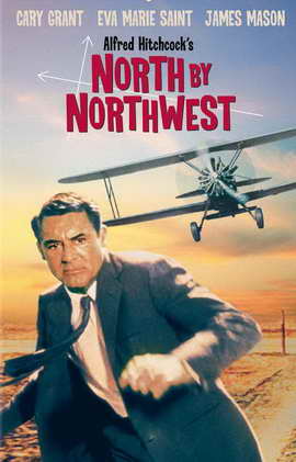
Comparing Taken to the poster from thriller classic North By Northwest it is varies in many respects. They are both similar by that they feature the main character in the foreground of the poster making them easily noticeable and connotates that they are the most important feature of the feature. However with the modern-day thriller Taken the use of colour is very different in the North By Northwest movie poster there is lots of vibrant colours appealing to the late 50's era whereas in Taken there is a desaturation of colour with darker colours e.g. greys and black combined with contrasting brighter colours to make certain aspects stand out. In the older posters they use full colour to make the whole thing noticeable, with the poster being in full colour it suggests maybe a more light-hearted style thriller possibly appealing to the whole family.

Thursday, 16 October 2014

Poster Analysis Kill Bill Vol 1

Poster of Kill Bill Volume 1,
used on cinema release
Stereotypically, conforming to the thriller genre this poster of 'Kill Bill' presents the hero character in the centre and to the front of the image, making her more noticeable on a plain background. This establishes a relationship between the viewer and character in the poster early on before they have even watched the movie. The character is using direct address in the picture singling out the viewer, making it seem unique towards them, it looks as though she is judging you. 

On an initial glance the first thing you notice is definitely the bright yellow colour scheme, this colour symbolises energy, action excitement and most relevant caution. This use of colour represents the character known as 'the bride' suggesting that the antagonists should be cautious and watch out for her. You can also see a black strip along the background of the poster which symbolises power, elegance, death, mystery, strength and authority all these can also be applied to the character of 'the bride' as from the whole movie we learn very little about her only her reason for revenge. With the mixture of yellow and black it gives the image of a bee and it's stripes giving off a warning.

The tagline "A ROARING RAMPAGE OF REVENGE" adds to the excitement and intensity of the title of the film 'Kill Bill' it lets the audience get a better grasp as to what the film is about maybe even suggesting who 'Bill' is. The colour of the tagline is in red (capital) letters symbolising blood. This connotates pain, revenge, hatred, danger and alternatively romance which in the film we find out about the brides' relationship with Bill. To apply Todorov's narrative theory the title of the movie suggests that it is already in a state of disequilibrium in which the protagonist (the bride) needs to sort out for herself. Mixed with the name of the character and the idea of a 'rampage' gives off an unusual thought that a bride would be in such a situation, this suggests that with the film all is not what it seems.

The jumpsuit (also yellow and black) is designed like leathers for a motorbike – giving the character a rebellious and fearless look of nature to her. This combined with her facial expression gives her the image of power.

Another thing which is really noticeable is the character in the poster is holding a samurai sword, this relates directly to a, the storyline and b, to its director Quentin Tarantino who is renound for his love of Asian culture. The sword connotates power and authority. This could be considered a bit unusual to have such an item in a thriller movie, as the majority have high-tech guns.

Teaser poster of Kill Bill Volume 1,
used initially to promote the film
before release.

All factors which are featured in this film – it gives a lot away about what might relate to this film. In red is also ‘Volume 1’ which draws attention to this text and implies that this is the first of a series or the first instalment to this particular story, engaging the audience to maybe think about other sequels.

In this other poster (to the right) it has the same colour scheme as the final poster but this could be considered as one of the teaser posters before launch. The tagline on this one however related to the unusual style of the thriller with the words "HERE COMES THE BRIDE." this is similar to a play on words in which instead of it being used in the 'traditional' sense it is interlinked with the idea of revenge that the antagonist 'Bill' is suppose to fear her. You can see this in silhouette of the ninja quite clearly not the 'typical' bride.

Overall this poster is simple but effective, it is clean and streamlined, the simple bold colour scheme makes it easy to navigate as well as setting a picture in peoples minds (i.e. they will remember it in the future). 

Thursday, 9 October 2014

Pulp Fiction Hamburger Scene Analysis

Close Up (0:42 mins)

In this scene of the Thriller Pulp Fiction Quentin Tarantino uses a close up shot on Joules. Through this shot it conveys the emotion that the character is feeling, in this particular scene we can tell that he is extremely angry possibly even slightly surprised at what is going on. From this shot it gives the viewer a sense of build up in tension and anger, as the first time you get to know the character it sets the tone for his ways later on (early expectations). You could suggest that the use of light on one side of Joules' face foreshadows his change in emotion/ direction later on in the movie (when he retires). There is no background sound (no dieagetic nor non-dieagetic) in this scene overall as this makes it more naturalistic (as though you are there) as well as creating a 'silence' tension when no one is talking, gives an ambient background; the only audio from this particular clip is dialogue. Joules and Vincent are the dominant (alpha male) characters in the scene, this is typical of movies for the 'villains' to be dressed smart... although in this film these aren't the generic characters. These characters represent the disequilibrium in the particular scene. 'Villian' characters Joules and Vincent in this scene are seen wearing smart black suits. The colour black is associated with power, fear, mystery, strength, authority as well as death; this likewise relates to Joules referring himself later on in the film as "the reaper".

Low angle shot (4:14 mins)

The use of this low angle shot is used to make us feel vulnerable (as though we are at the same level as the victim). It is clear that from this shot the character Joules is in control of the situation he is the one the angle shot is looking up to, giving giving him the authority. With the use of light shining on him combined with his stance and the camera shot it gives him a 'god like' appearance (possibly relating to his bible speech later on in the scene). With the distorted angle of the low angle shot it shows the imbalance of order in the movie at their particular scene, it also could also show that something is wrong with the scene (things maybe don't add up at this point in the movie). We can additionally look at the use of weaponry in this clip, there is a clear association between the hit-men (Joules and Vincent) who have the guns and those who are the 'victims' in the flat; they are quite obviously out matched. You can notice that the pictures with weaponry in this movie overall is as is typical for most movies (not just thrillers) for those to be very masculine scenes. The use of weapons sparks interest and action into a scene, in some genres it would be unusual for the characters to carry guns however in thriller movies it is considered typical and conventional for most characters to have these props.